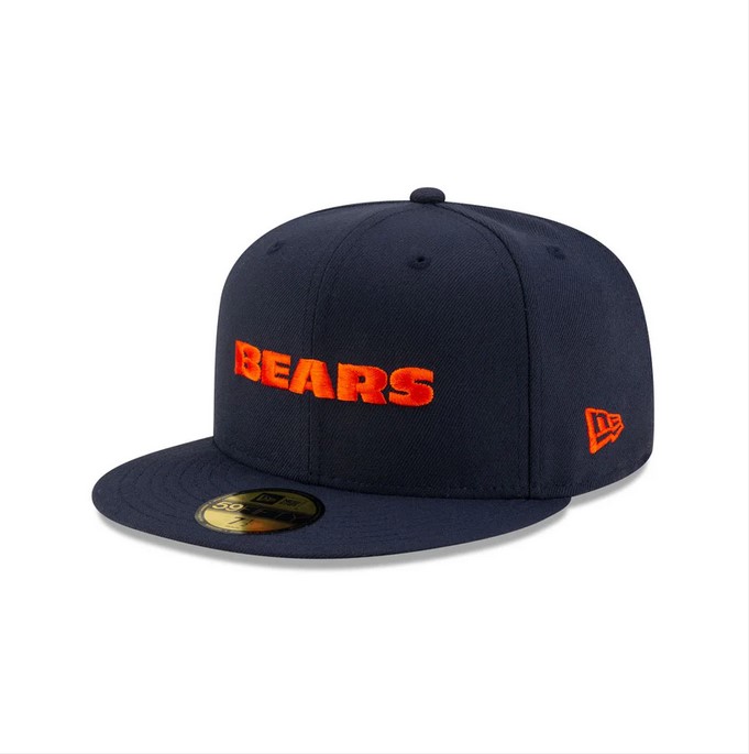
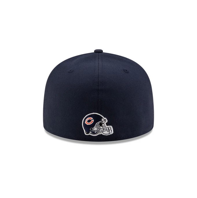
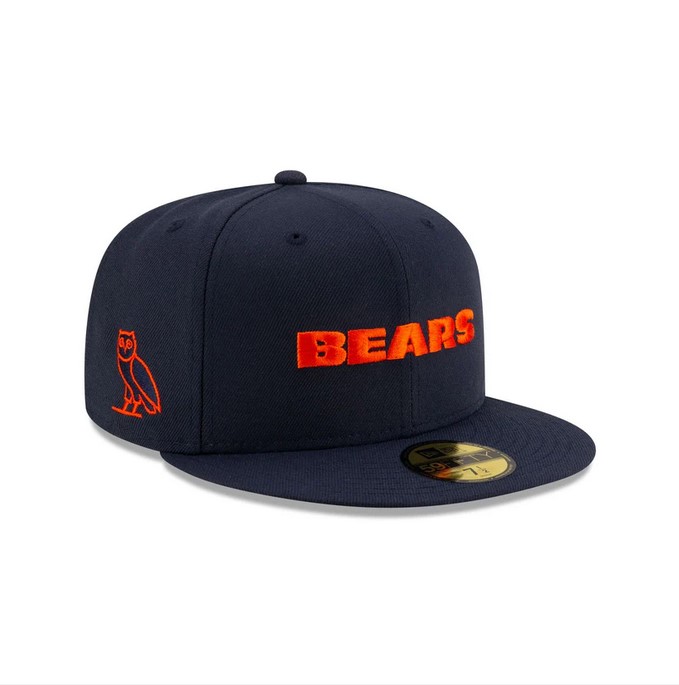
This is a collaboration that New Era did with OVO and I just found out about this recently. Navy blue and orange already work well together, but the design decisions of the logo and patches are what really caught my eye. The logo used is the wordmark for the Bears which looks great on the front of a hat. Its bold and distinct due to its color and contrast. The side patches are both balanced being not too large and also both being orange which creates even more contrast. The back patch brings something different to the back of the hat and I am here for it. Not often do you see a designer utilize a logo of that kind on the back of a hat, but it fits in naturally to the overall design of the hat.