I would love work for New Era, so why not pretend like I do?


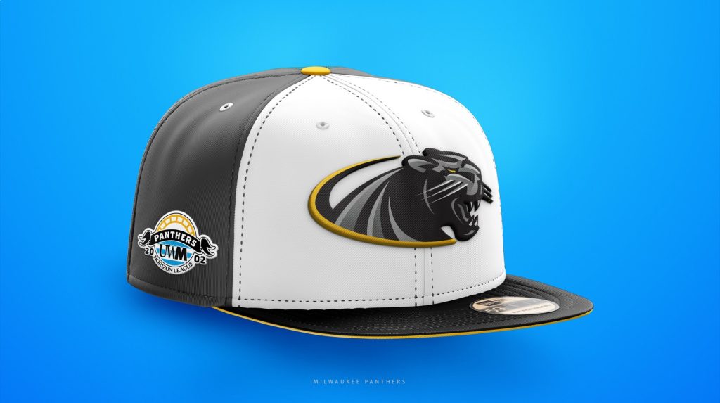
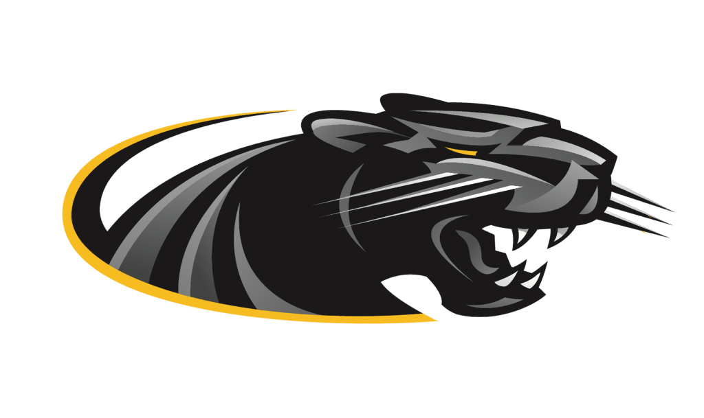
Logo
The UWM Athletic Panther logo because I have always admired its design. It not a copied design of another big cat logo like other schools have done which makes it very unique. Everything about this logo screams college sports and that is why I think it is a perfect choice for a design like this.
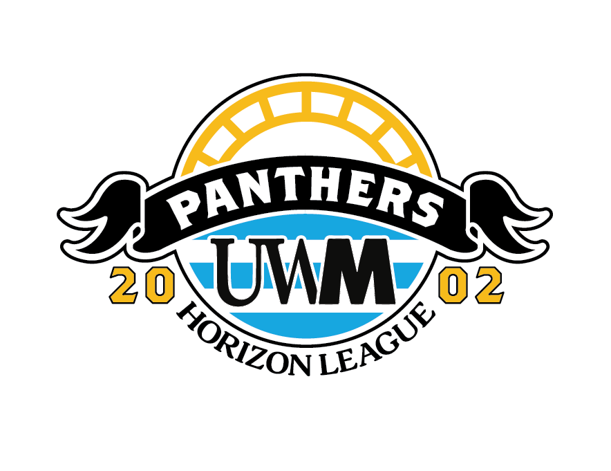
Side Patch
This is a custom patch designed by me after looking for inspiration through the UWM Baseball Program. I learned they won a championship in a division called the “Horizon League” in 2002. Many fitted hat designers use patches with a teams previous championship as the subject of the design.
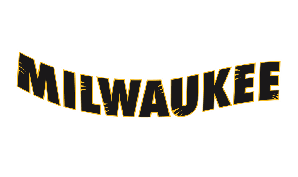
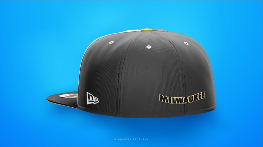
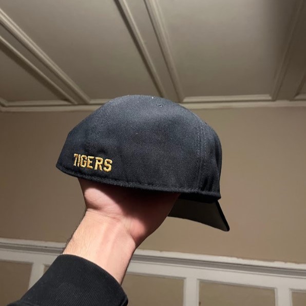
Back Patch
Many hats that I own look best when they have the name of the city as the back patch, instead of the MLB or division logo. I took this wordmark by dividing up the athletic logo into two separate parts. The wordmark fits great on the back of the hat helps signify what city this team is from.
Where did I get the hat mockup?
Inspiration
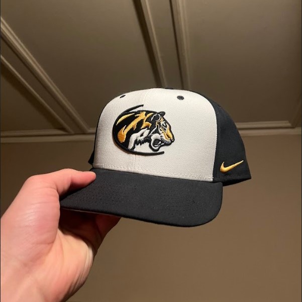
This is a hat that has changed my taste since I initially saw it. Having it since my junior year of high school, it has always stood out to me compared to my other hats. I always appreciated the white front with the accent colors of gold on the side and the back. It is such a simple, yet balanced hat. Both logos are unique with an original and quality design. The logo is also very similar to UWM’s athletic logo which is why I was confident that it would look great on a similar aesthetic. A huge pet peeve of mine is the way that schools still continue to recycle existing designs for their own branding. Although I never wear the hat, I have always kept it simply because of its design and the inspiration that it has given me.